
Client
Customer is one of the eminent marketing organizations in the US with a distribution channel of over 105,000 agents spanning across the entire country serving many large insurance companies. A leader in products focused on health insurance and life insurance in the USA.
01Discover
The client approached us for a redesign of the business dashboards looking for an improvement in some respects like better usability, data transparency and increased productivity for the users.
We conducted a UX review and evaluated the existing visualizations to identify issues that were causing an impact on the user experience.
We had workshops with the account team to get insights on business goals, target users and value propositions.

Discovery Workshops
Through discovery workshops with account team, we got insights on business goals, target users and intended value propositions.
02Define
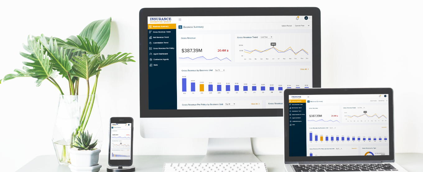
The existing visualizations and dashboard experience needed a redesign to address key problem areas such as improved usability, higher productivity, better data transparency and brand value.
Our Key Solutions
- Redesign of the visualization charts relating to the underlying data and at the same time conveying the story
- Simplify the dashboards by removing the clutters and noise
- Update the color scheme and typography to improve the brand value
- New information architecture to help users navigate the dashboard
03Design
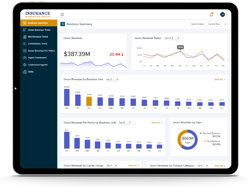
Dashboard 1
Gross revenue dashboard with comparative data presented in a clear way
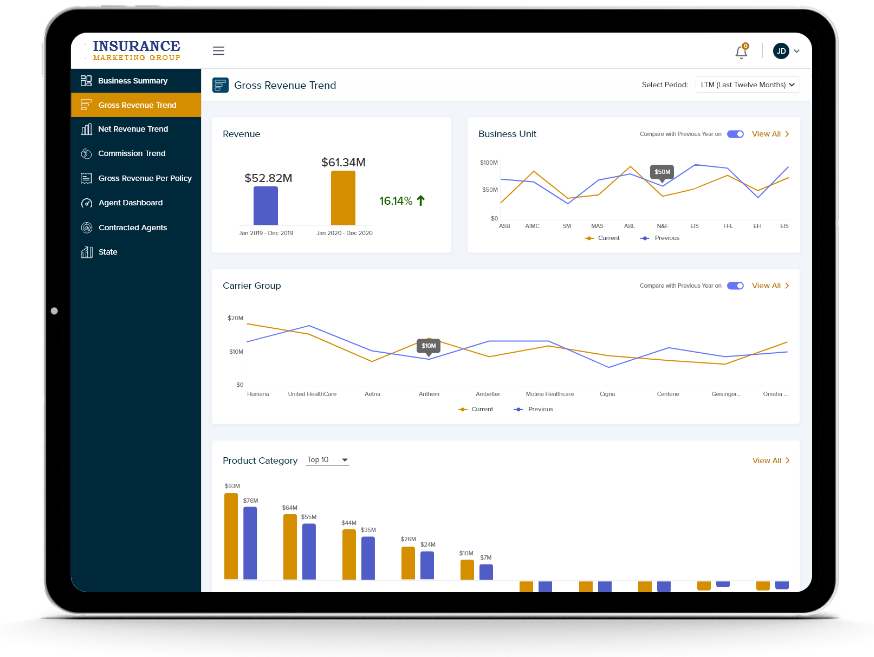
Dashboard 2
Dashboard screen that gives a quick overview of Gross Revenue Trend Summary