
Unified portal (re)design using human centric principles
Client
Client is a pioneer in cost containment, coordination of benefits and program integrity services for government health care programs in the US. Using information technology and data mining techniques, client identifies other insurance coverage, coordinates benefits, and recovers overpayments.
Business Needs
The client had multiple portal applications each serving different customer stakeholders. In addition to the disconnected experience due to multiple portals, the overall experience was dated and non-intuitive. The client approached us to create an enhanced customer experience by unifying the different portals and ensure data transparency to their users w.r.t finance, operations, and product performances.
01Discover
We assessed the applications against heuristics which helped us to identify the key areas that impacted overall user experience which was not seamless. We discovered that data presented were not clearly aligned with org objectives of being transparent to customers.
Heuristic Evaluation
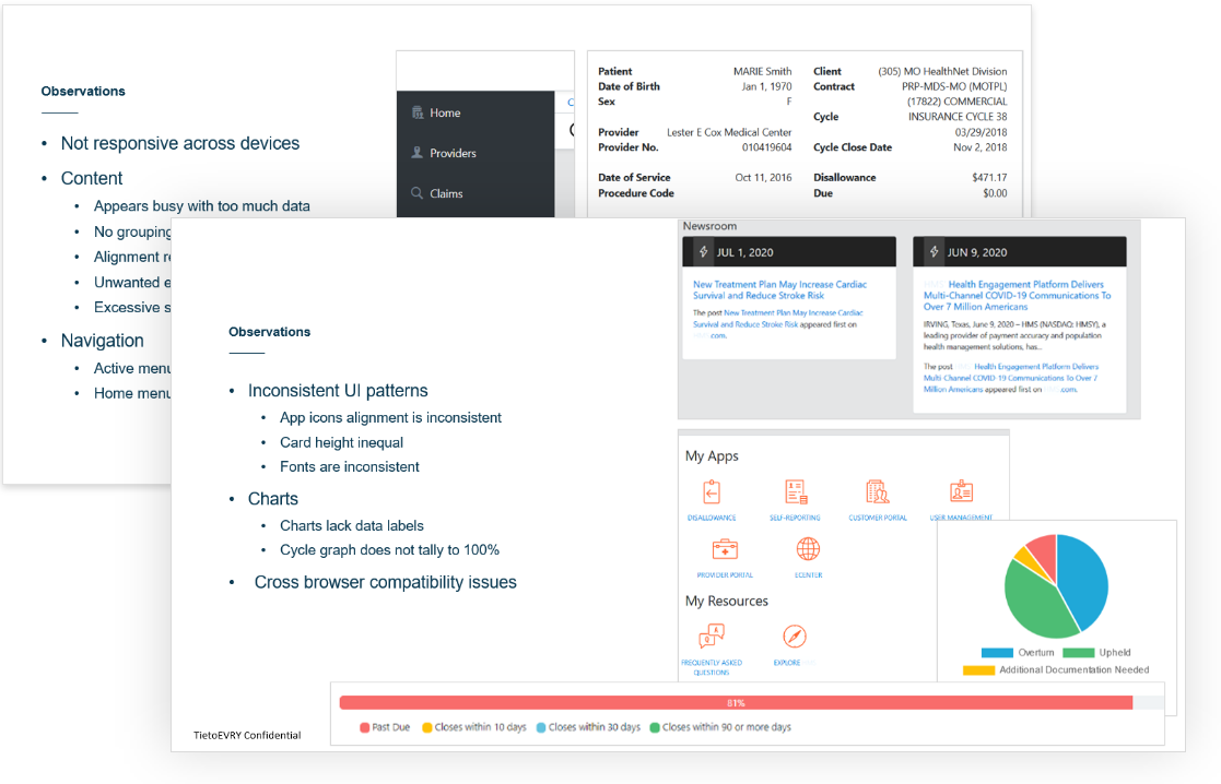
We identified that these are some areas we must focus us on to improve the designs.
- Design Aesthetics
- User Interaction
- Workflow Efficiency
- Input Forms
- Information Architecture
- Accessibility
- Layout
- Clarity
- Standards & Guidelines
Persona
We conducted a brief user research to understand the demographics, goals and pain points of the end users. We identified two personas who were the potential users of the applications.


02Define
We defined the client requirement as to unify both the applications giving a seamless experience to the users and also increase productivity and brand value.
Wireframes
We designed wireframes which were showed to the stakeholders to get early feedback. This quick feedback helped us to iterate faster.
03Design
We conceptualized a unified experience and created multiple design options to the client. Based on their feedback, a best design was chosen that fits their needs for the project.
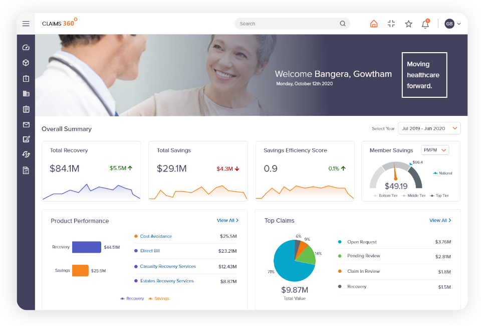
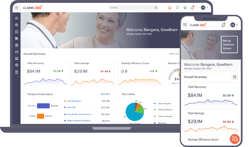
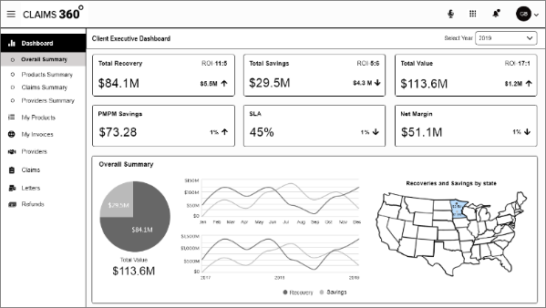
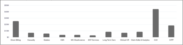
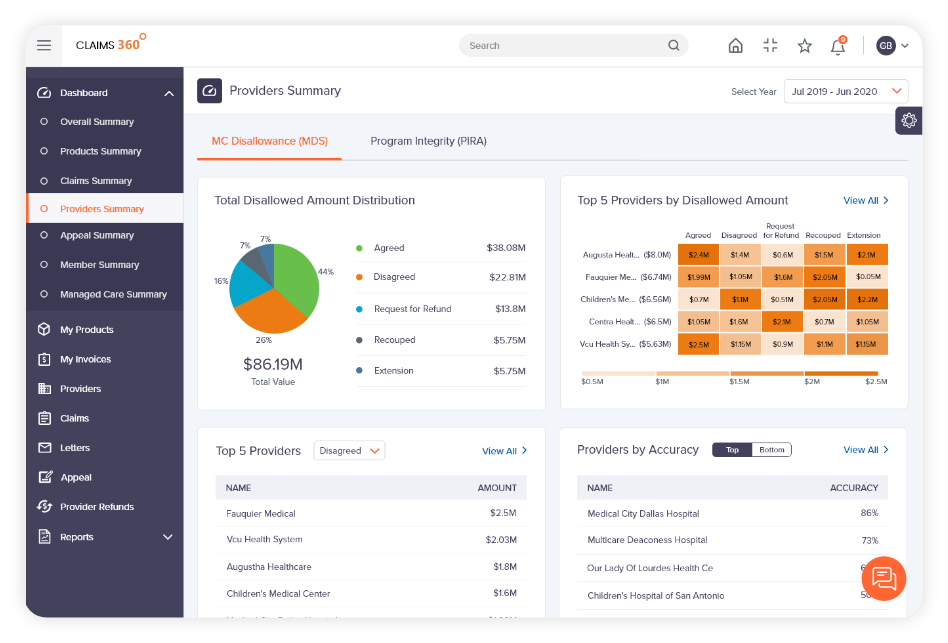
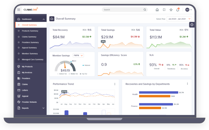
The new landing screen gives a quick overall summary of claim recoveries and other key metrics in an intuitive manner
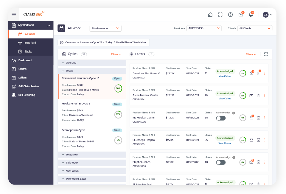
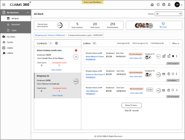
An intuitive workload module was designed which had the tasks grouped by important parameters to help users to effectively manage their daily work
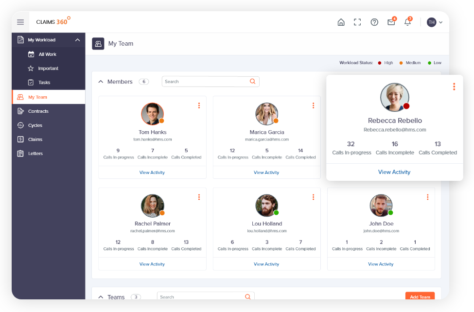
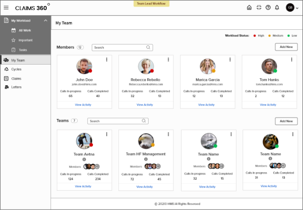
Teams page that gives a summary on all team members
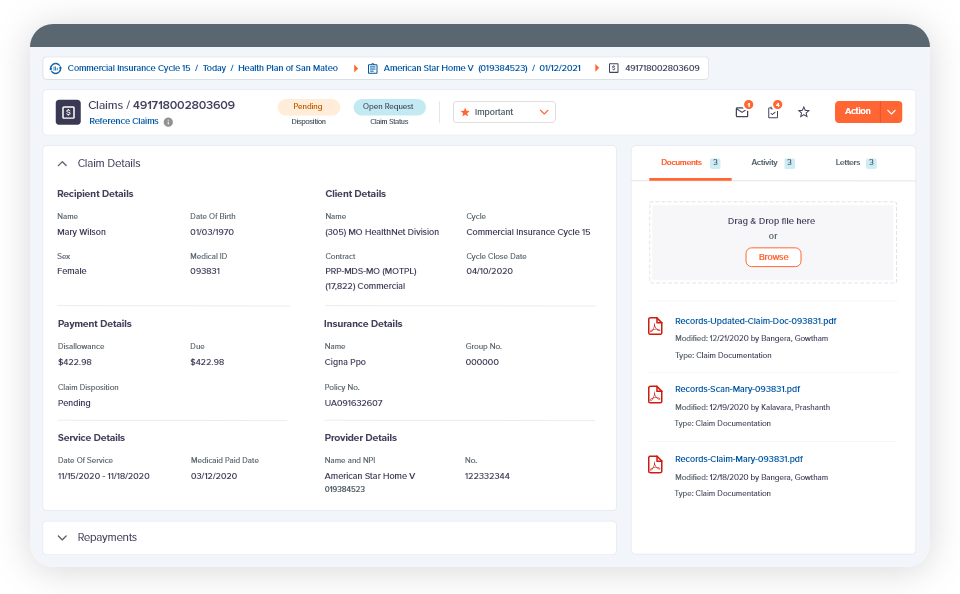
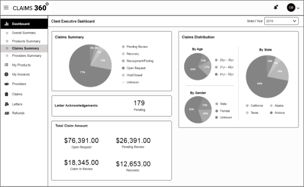
Claim details page that displays information in a clear structure and format for easy reading
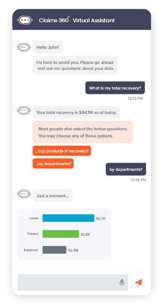
An innovative virtual assistant was designed to assist users in a more intuitive, conversational mode
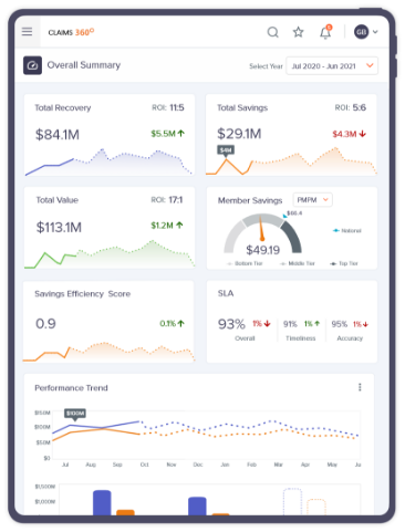
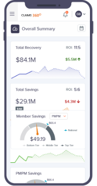
Overall design was responsive that adjusts according to the device resolution