Client
The client offered several web applications to their customers who were required to access multiple applications to accomplish their tasks. Since these applications were built in different time periods, they had different look and feel, and also presented the same experience differently. As a result, the users had a very disconnected experience when accessing these applications which affected brand perception along with productivity.
01Discover
We conducted multiple rounds of stake holder interviews to understand the following details:
- Business Goals
- User Persona
- Competition
- Technological & Business Constraints
- Success Factors
During the stakeholder interviews, we got insights on how these different applications were working together to achieve the customer’s goals. We observed that its causing lot of friction while switching between the applications reducing the overall productivity.
02Define
We discovered that the users needed a connected and seamless experience while using these applications to reduce friction. Hence, we prioritized portal unification as the key solution.
Our Key Solutions
- Optimized the steps in the workflow process
- Improved navigational structure that guides users to complete the tasks with no confusion
- Introduced data visualization and dashboards to make grasping data easy and interesting
- Improved design aesthetics by inculcating current design trends like minimal design, flat icons & typography
03Design
We designed wireframes quickly and got valuable feedback which helped us to improve the workflows and reach the best suitable solution. Basis the finalized wireframes, we designed hi-fidelity designs that reflected seamless integration of applications along with minimalistic design and enhanced brand value.
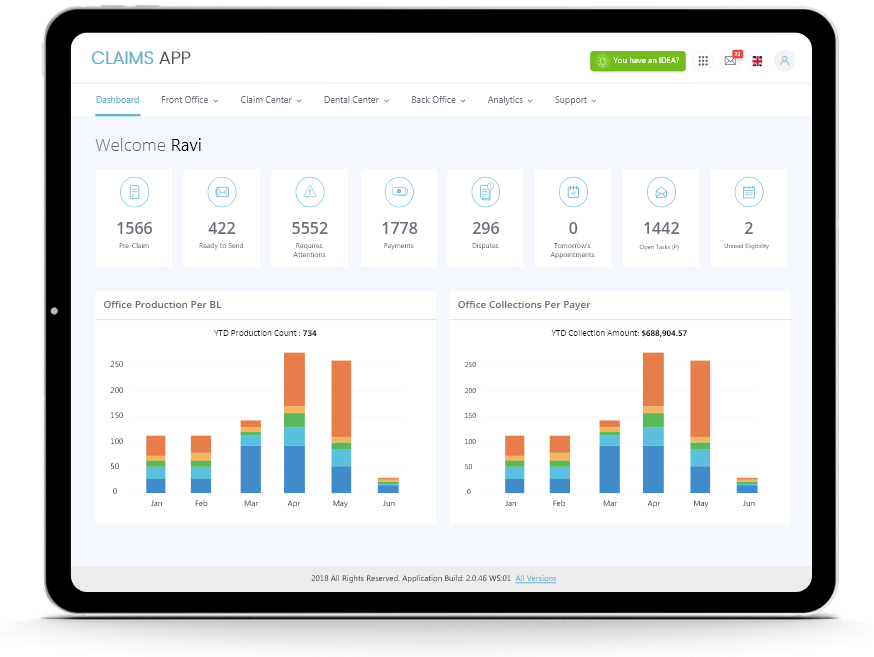
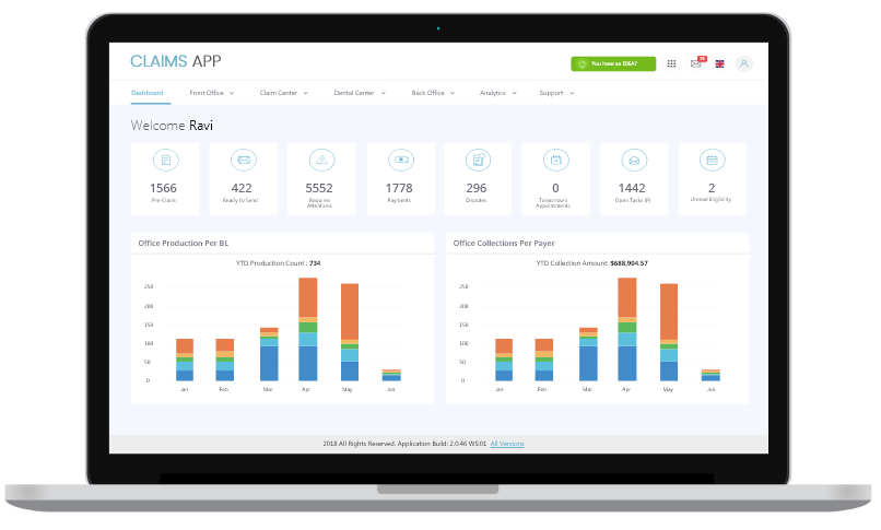
Dashboard page that gives a quick overview of key insights with visual charts.

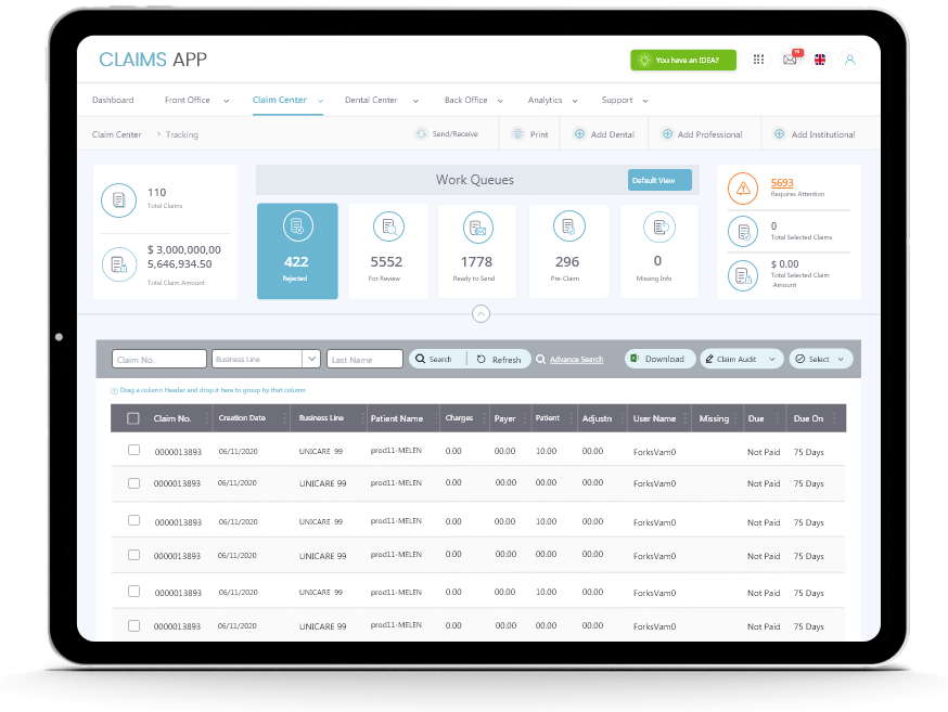
A claims list page where user can perform quick, contextual actions


